Wednesday, 11 January 2012
Review: Wolverine And The X-Men #4
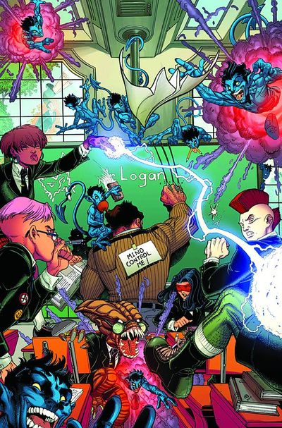
Wolverine And The X-Men #4 By Aaron / Bradshaw
It's safe to say that the X-Men franchise has not been at its healthiest in recent years. Usurped by the Avengers as Marvel's top property, and struggling for consistency, it seemed that the X-Men's most recent reboot may have signalled a return to better days with solid reviews across the board. Wolverine And The X-Men's debut arc was a particular triumph, featuring strong characters, effortless humor and superb artwork throughout from Chis Bachalo. Expectations have been high since the titlesopening issue, which makes its first misfire all the more disappointing.
This issue is a done in story and something of a departure from the frantic action of the opening arc. Jason Aaron takes the opportunity to introduce a handful of new characters and subplots, as well as to nurture some of the ideas introduced in his first three issues. At various points the plot seems to paint itself as a Wolverine centric story, which seems a rather tacked on idea. Wolverine's interior narration comes only on the issues first and last pages, and seems rather forced and unnecessary given the fairly small role that he plays in the plot. Wolverine's titular role in the series is not one that has bothered me as yet, but if he is crowbarred into every story it will begin to grate. His recent hi-jinks with X-Force allow the introduction of a former X-Men favourite, namely Warren Worthington III Aka Angel, although due to a significant recent trauma he has lost his memories and believes himself to be an angel of the slightly more literal kind. As an idea it falls totally flat for me. Aaron chooses to play the character entirely for laughs and it seems very jarring and ultimately unsucessful, despite the writer largely succeeding with his humor in the titles opening few issues.
Nick Bradshaw's art too, is a step down from Bachalo's in the opening three issues. I am not a fan of his style at all, and although it shares the cartoony quality of Bachlo's work, it lacks the edgy quality that makes his work such a joy to look at it. Bradshaw's work is defined by smooth lines and while his use of detail is excellent, his style as a whole is unfortunately not for me at all and detracts from the story.
That's not to say that this issue is all bad. A new student is introduced, and he seems like a genuinely fascinating character with a lot of potential. The existing students too were dealt with well, and Aaron seems to have a good handle on his supporting cast, each character fitting into a clearly defined role without their actions ever coming across as formulaic or dull. His willingness to mine the Marvel Universe for existing characters and continuity is welcome too, and having Deathlok appear was a nice surprise.
If anything, this issue suffered from the quality of those that have come before it. Bradshaw's artwork is worlds apart from Bachalo's style, and much of the kinetic energy of Aaron's opening arc has fizzled out. There are positives though - Aaron's cast of characters look to be interesting and promise a lot, while his use of the more iconic characters has been nothing if not solid. A backwards step, but not an irreversible one.
C
Subscribe to:
Post Comments (Atom)


No comments:
Post a Comment